Use Cases
Mobile-Friendly Form Design: Boost Conversions on Any Device
Learn how to design mobile-friendly forms that improve user experience and conversions. Practical tips from Noxtiz, an independent Jotform partner.
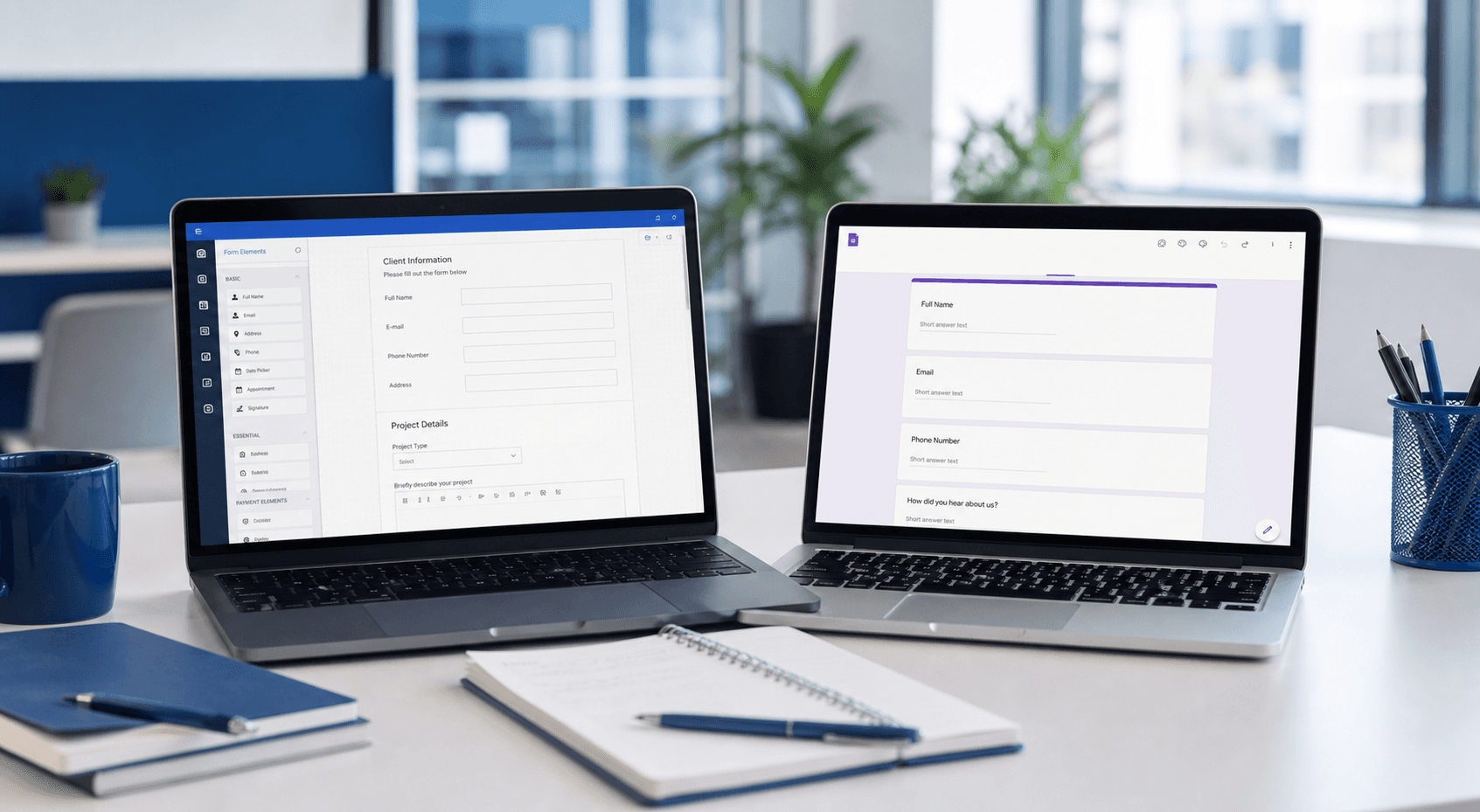
Designing forms for mobile devices doesn't have to be daunting. Discover key principles and actionable tips to create forms that look great on any screen size.
Why Mobile-Friendly Forms Matter
With more than half of all web traffic now coming from mobile devices, your forms must work seamlessly on smartphones and tablets. A form that looks perfect on a desktop can become an exercise in frustration on a small screen—tiny text, misaligned fields, and awkward scrolling frustrate users and kill conversions. Research shows that mobile-friendly forms can increase submission rates by up to 160%.
Beyond aesthetics, mobile optimization directly impacts user trust. When a form is difficult to use on a phone, visitors often abandon it entirely. By prioritizing mobile-friendly design, you show users you value their time and are committed to a frictionless experience. This is especially critical for lead generation, registrations, and checkout flows where every second matters.
Key Principles for Mobile Form Design
Simplicity is the foundation of mobile-friendly forms. Stick to a single-column layout—multiple columns force horizontal scrolling on small screens, which is a conversion killer. Keep your fields as few as possible, asking only for the information you truly need. The less effort you ask from users, the more likely they are to complete the form.
Touch targets must be large enough (at least 48px) and well-spaced to prevent accidental taps. Use clear, visible labels that remain even after the user starts typing (floating labels are a smart choice). Finally, always test your forms on real mobile devices, not just in browser developer tools, to catch edge cases and responsiveness issues.
- Use a single-column layout for easy thumb navigation.
- Keep touch targets at least 48 x 48 pixels to avoid mis-taps.
- Minimize the number of fields; request only essential data.
How Noxtiz Can Help You Optimize Forms
Noxtiz, as an independent Jotform partner, understands the nuances of mobile form design. We recommend leveraging Jotform's built-in responsive templates and conditional logic to create forms that adapt perfectly to any screen size. With Jotform, you can easily adjust field widths, hide non‑essential fields on mobile, and add progress bars to longer forms—all without writing a single line of code.
Our team suggests starting with a mobile‑first design approach: build your form layout on a small screen first, then expand for desktop. This ensures every element is intentionally placed for the smallest canvas. To see how your existing forms perform on mobile, test them using Jotform's preview mode on different device sizes—and if you need expert guidance, Noxtiz is here to help you fine‑tune every detail.
Ready to go further with Jotform?
The Gold plan gives you more submissions, more storage, no Jotform branding, and access to advanced features like conditional logic, payment integrations, and approval workflows. Most businesses find it the best value.
- Up to 100 forms and 10,000 submissions per month
- 100 GB of storage and 10,000 encrypted uploads
- Remove Jotform branding on forms
- Advanced features: conditions, payments, approvals, and widgets