
Small Business
Mobile-Friendly Form Design: Boost Small Business Conversions
Learn how to design mobile-friendly forms for your small business using Jotform. Improve conversions, reduce friction, and capture leads on any device.
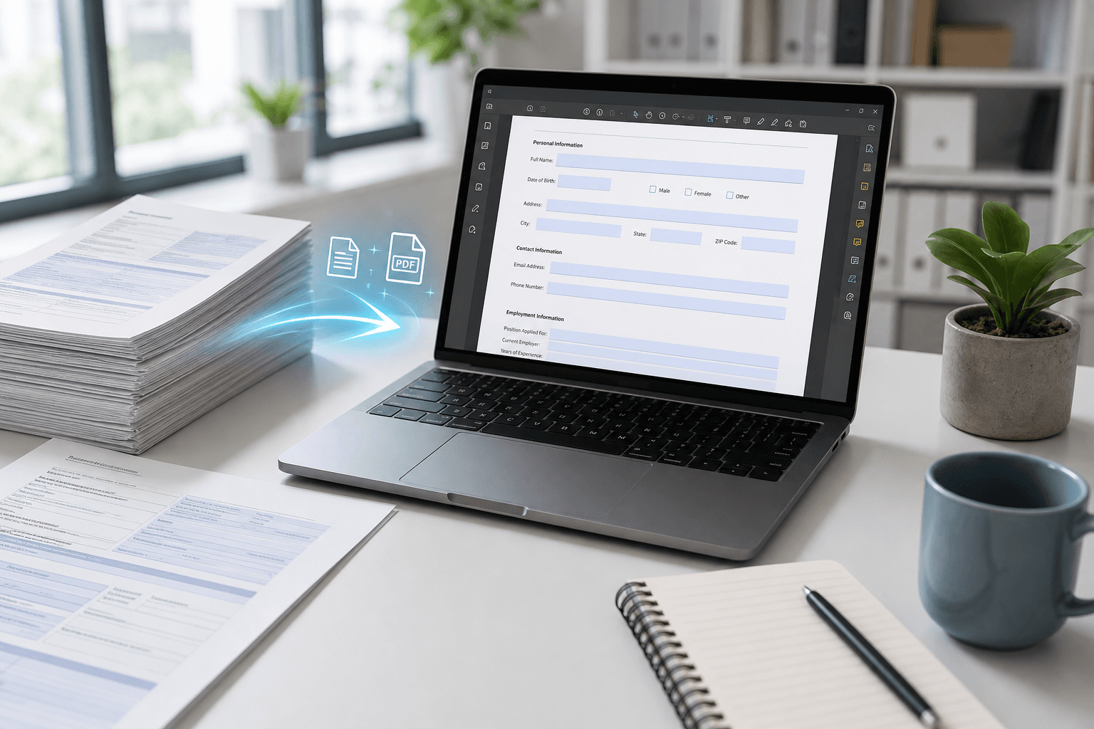
Over half of your website visitors use mobile devices. If your forms aren't mobile-friendly, you're losing leads. Discover practical tips for designing forms that work perfectly on smartphones and tablets.
Why Mobile-Friendly Forms Matter for Small Businesses
More than 60% of web traffic now comes from mobile devices, and that number continues to grow. For small businesses, this means your potential customers are likely submitting forms on their phones while commuting, waiting in line, or browsing at home. If your forms are difficult to fill out on a small screen—tiny text, cramped fields, or horizontal scrolling—you risk losing those leads entirely.
Form abandonment rates on mobile are significantly higher than on desktop. A poorly designed form can frustrate users and drive them to a competitor. By prioritizing mobile-friendly design, you create a seamless experience that helps capture more inquiries, orders, and sign-ups. This isn't just about aesthetics; it's about making your forms accessible and easy to complete wherever your audience happens to be.
- Keep the number of form fields to a minimum—ask only for essential information.
- Use large touch targets (at least 48x48 pixels) for buttons and input areas.
- Design forms in a single-column layout to avoid awkward horizontal orientation.
Key Design Principles for Mobile Forms
Every mobile form should start with a clear, single-column layout. Multiple columns on a small screen force users to zoom in and out, which is both annoying and error-prone. Place labels above their corresponding fields instead of beside them, so they remain visible even when the virtual keyboard appears. Also, enable auto-fill and auto-capitalization where appropriate—these small conveniences reduce typing effort and improve accuracy.
Error messages need to be concise and placed right next to the problematic field. On mobile, users can’t easily scroll back and forth to find errors. Use inline validation that gives real-time feedback, and always provide a clear call-to-action button that stands out. Finally, test your forms on actual mobile devices (not just resized browser windows) to catch unexpected layout issues or keyboard overlaps.
Getting Started with Jotform for Mobile-Ready Forms
Jotform offers a wide range of responsive form themes that automatically adapt to any screen size. You can start with a pre-built mobile-friendly template, then customize colors, fonts, and fields without writing code. This makes it easy for small business owners to create professional forms that look and function well on phones, tablets, and desktops alike.
For businesses that want to go a step further, Noxtiz recommends enabling Jotform's mobile-optimized form view and using conditional logic to show or hide fields based on previous answers. This keeps forms short and relevant on mobile devices, reducing friction and boosting completion rates. Additionally, take advantage of Jotform's offline submission feature so leads aren't lost if a user loses connection while filling out a form.
Ready to go further with Jotform?
The Gold plan gives you more submissions, more storage, no Jotform branding, and access to advanced features like conditional logic, payment integrations, and approval workflows. Most businesses find it the best value.
- Up to 100 forms and 10,000 submissions per month
- 100 GB of storage and 10,000 encrypted uploads
- Remove Jotform branding on forms
- Advanced features: conditions, payments, approvals, and widgets